This continues my series on ways you’ve probably used design patterns in real-life and may not have even known it.
I’m going to go even further outside of the standard software design patterns into UI design patterns. Specifically, I wanted to address the bread crumb, a UI design pattern that concerns navigation. In web development the bread crumb is a standard control that has become almost necessary to help the user keep track of where they are. Unlike in an application where users tend to stay in one general area, web sites and web applications often have users moving through multiple pages and it’s easy to get lost. I’m sure you are all familiar with the bread crumb in web development.
Above you can see a bread crumb control from Dell’s website. Because there is depth to navigation in most websites the bread crumb helps provide a path for users to return to where they started.
The BreadCrumb in WPF
But how does this apply to desktop application development? As I mentioned above desktop applications tend to be very focused in a single area. There are, however, two primary areas I’ve witnessed where users get lost. The first is in standard business applications where the application has a high number of forms that users have to navigate through. Getting user information, family information, contact information, alternate contact information, etc… it’s easy for users to get lost in their path trying to gather information on clients/customers. The other is in deeply nested trees.
I wanted to present to you a basic bread crumb control. The solution/code provided is a bit of an ugly hybrid in terms of MVVM and code-behind but will get across the basic steps you need to take. Also by providing a working solution in WPF hopefully I’ve done a lot of the work for you.
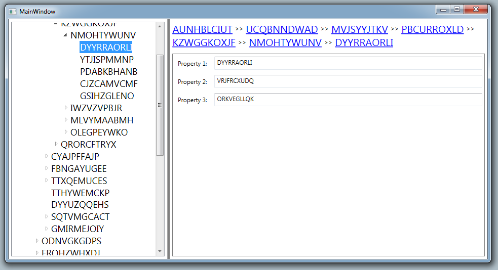
The image above is from the sample provided that demonstrates where a bread crumb control is especially useful. When dealing with trees it’s easy to get lost. By providing a bread crumb control you make it easier for your users to navigate through the tree.
Let’s start with the interface the control uses, IParent:
public interface IParent
{
    IParent Parent { get; }
}
Pretty simple. The node that I bind the tree to implements the IParent interface. This way my BreadCrumb control can be a bit more multi-purpose.
Next is looking at BreadCrumbs.xaml:
<UserControl x:Class="BreadCrumbs.Views.BreadCrumbs"
             xmlns="http://schemas.microsoft.com/winfx/2006/xaml/presentation"
             xmlns:x="http://schemas.microsoft.com/winfx/2006/xaml"
             xmlns:mc="http://schemas.openxmlformats.org/markup-compatibility/2006"
             xmlns:d="http://schemas.microsoft.com/expression/blend/2008"
             mc:Ignorable="d"
             d:DesignHeight="300" d:DesignWidth="300">
    <UserControl.Resources>
        <!--http://stackoverflow.com/questions/780426/link-button-in-wpf-->
        <Style TargetType="Button"
               BasedOn="{StaticResource ResourceKey={x:Type Button}}">
            <Setter Property="Width" Value="Auto"/>
            <Setter Property="Template">
                <Setter.Value>
                    <ControlTemplate TargetType="Button">
                        <ContentPresenter Content="{TemplateBinding Content}"
                                  ContentTemplate="{TemplateBinding  ContentTemplate}"
                                  VerticalAlignment="Center">
                            <ContentPresenter.Resources>
                                <Style TargetType="{x:Type TextBlock}">
                                    <Setter Property="TextDecorations" Value="Underline" />
                                </Style>
                            </ContentPresenter.Resources>
                        </ContentPresenter>
                    </ControlTemplate>
                </Setter.Value>
            </Setter>
            <Setter Property="Foreground" Value="Blue" />
            <Setter Property="FontSize" Value="20" />
            <Setter Property="Cursor" Value="Hand" />
            <Style.Triggers>
                <Trigger Property="IsMouseOver" Value="true">
                    <Setter Property="Foreground" Value="Red" />
                </Trigger>
            </Style.Triggers>
        </Style>
    </UserControl.Resources>
    <WrapPanel x:Name="pnlContent" />
</UserControl>
The main thing that is interesting here is the style that targets button. In general, we try and present a look and feel that users expect. That’s not a hard and fast rule and I’m certainly open for change in this area, but a generality. By styling the buttons to look like a link we provide a navigational interface users expect.
And now for BreadCrumbs.xaml.cs:
public partial class BreadCrumbs : UserControl
{
	public IParent SelectedItem
	{
		get { return (IParent)GetValue(SelectedItemProperty); }
		set { SetValue(SelectedItemProperty, value); }
	}

	// Using a DependencyProperty as the backing store for SelectedItem.  This enables animation, styling, binding, etc...
	public static readonly DependencyProperty SelectedItemProperty =
		DependencyProperty.Register("SelectedItem", typeof(IParent), typeof(BreadCrumbs), new PropertyMetadata(null, OnSelectedItemChanged));

	private static void OnSelectedItemChanged(DependencyObject d, DependencyPropertyChangedEventArgs e)
	{
		((BreadCrumbs)d).BuildPath(e.NewValue as IParent);
	}

	public BreadCrumbs()
	{
		InitializeComponent();
	}

	private void BuildPath(IParent Node)
	{
		pnlContent.Children.Clear();
		while (Node != null)
		{
			Button b = new Button();
			b.Content = Node.ToString();
			b.Click += b_Click;
			b.Tag = Node;
			pnlContent.Children.Insert(0, b);
			Node = Node.Parent;
			//if we have more parents then we want a seperator
			if (Node != null)
			{
				Label seperator = new Label();
				seperator.Content = ">>";
				pnlContent.Children.Insert(0, seperator);
			}
		}
	}

	void b_Click(object sender, RoutedEventArgs e)
	{
		IParent selectedItem = ((Button)sender).Tag as IParent;
		SelectedItem = selectedItem;
	}
}
The first interesting thing is the dependency property SelectedItem. When this gets used in the parent control we need a dependency property to bind the selected against. In this parent control we use Mode=TwoWay so that not only do we get the item when it is selected from the tree but we can also set the selected item in the parent control by setting our own dependency property.
The BuildPath method is pretty straight forward. We know we have an IParent node and we already have the style set up on the xaml to make all our buttons look like links. We just have to iterate over the node and any parents. And since we’re using a wrap panel all the buttons will show on the control. We also set the SelectedItem when the button is clicked. This allows us to update the SelectedItem in the parent control so that the navigation via the bread crumbs allow users to move backward through the tree.
There is certainly future expansion that can be done here as there may need to be some limit on the wrap panel or you may want to show only n number of nodes back.
Hopefully you get some use out of this. The complete source code is in sample provided. If you have any questions or problems let me know.
Thanks for reading,
Brian


